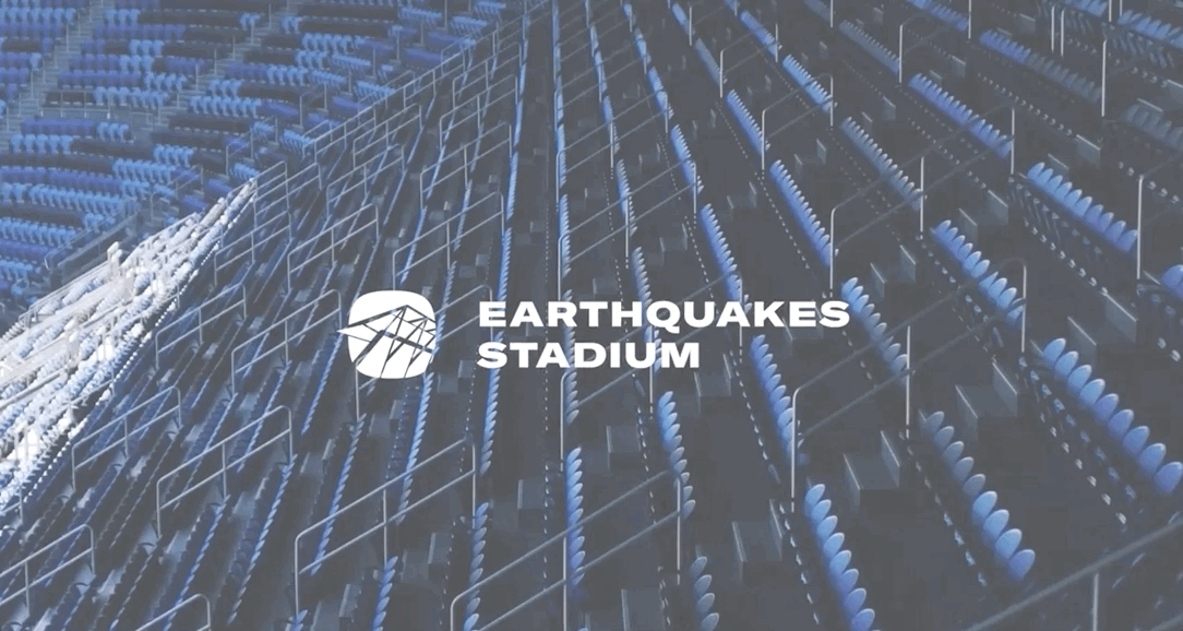
UPDATE: Earthquakes Stadium (2020-2021) is dead, long live PayPal Park. This logo served its purpose well between naming rights partners.
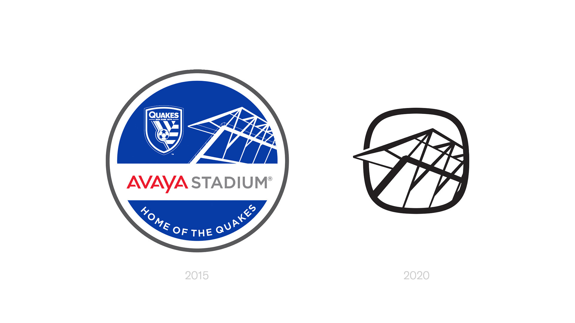
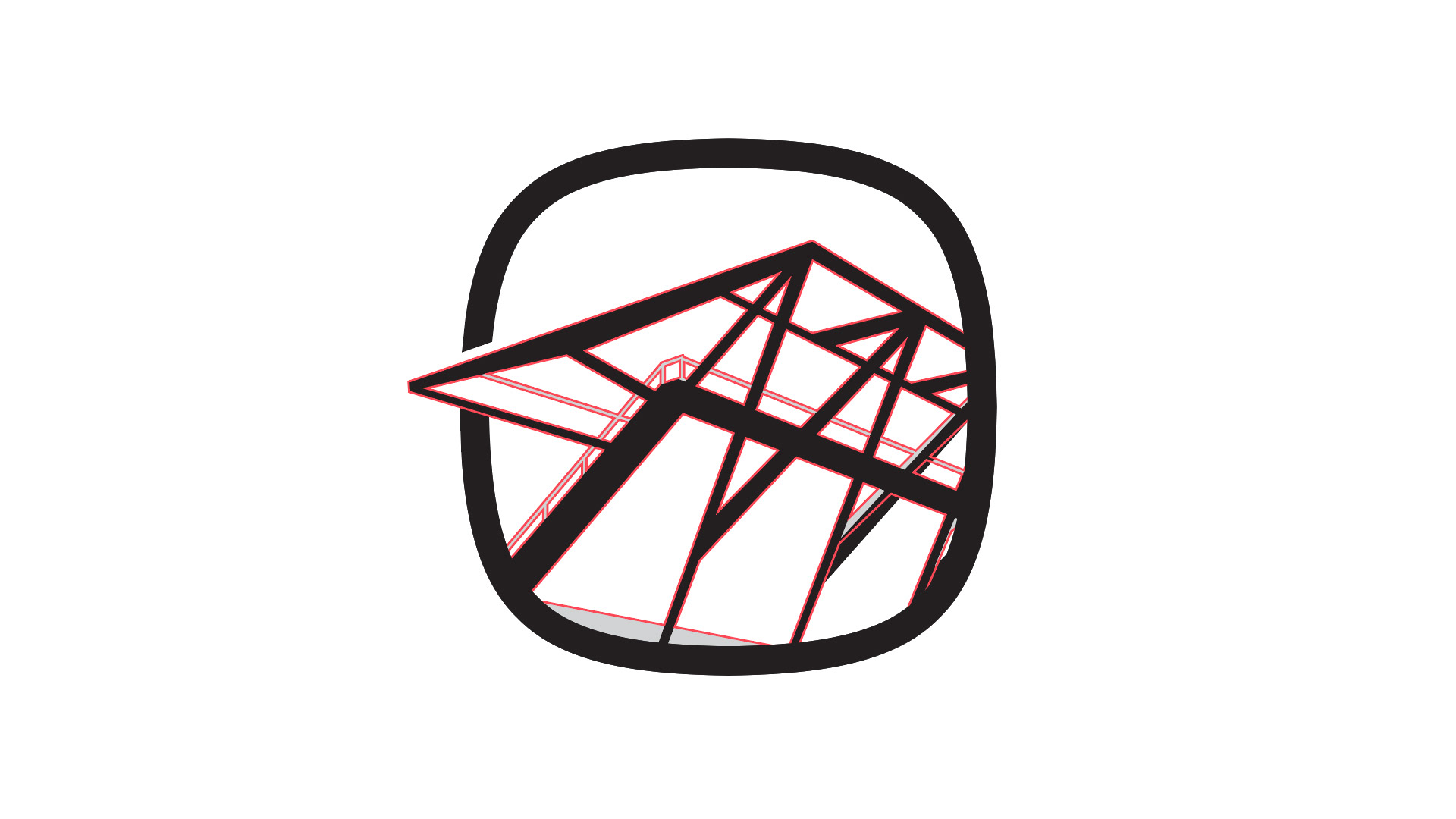
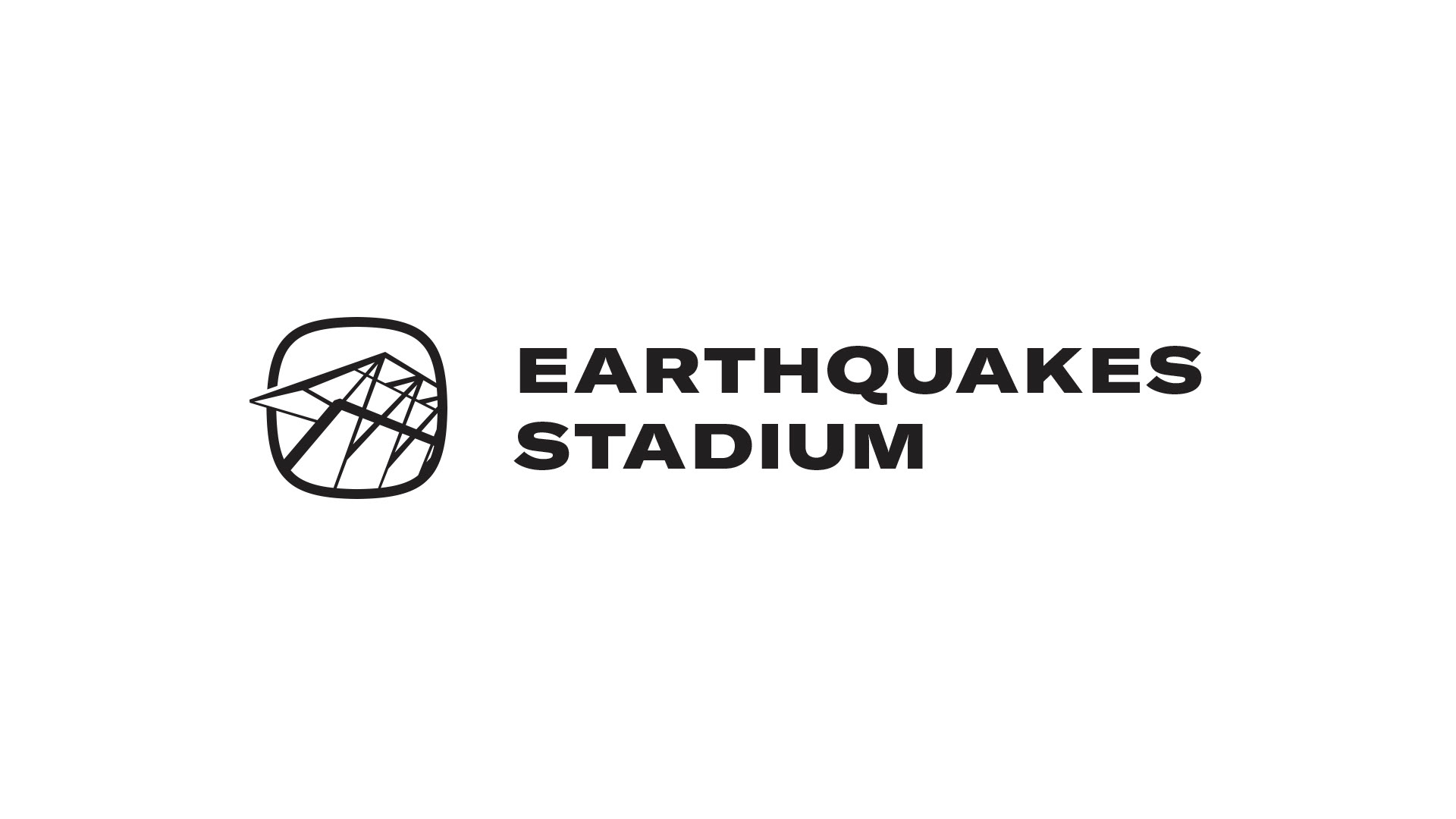
When the previous naming rights partnership expired, I was tasked with creating a new logo for Earthquakes Stadium. Working from the belief that it's important for a stadium's logo to pay homage to its profile or another recognizable feature, I modified the silhouette from the old logo to make it a strong centerpiece that can complement a wordmark or stand alone as an icon. The silhouette is bound by a superellipse (ok, a "squircle") which, besides being a unique and appealing frame, is shaped like an airplane window—every seat in the stadium has a view of planes taking off and landing at SJC across the street.
I've attended almost every Quakes game and many other events in this building since it opened in 2015. It's a thrill to leave my mark on it.
Below, a comparison of the old and new logos.